Twisted Licks Packaging Design
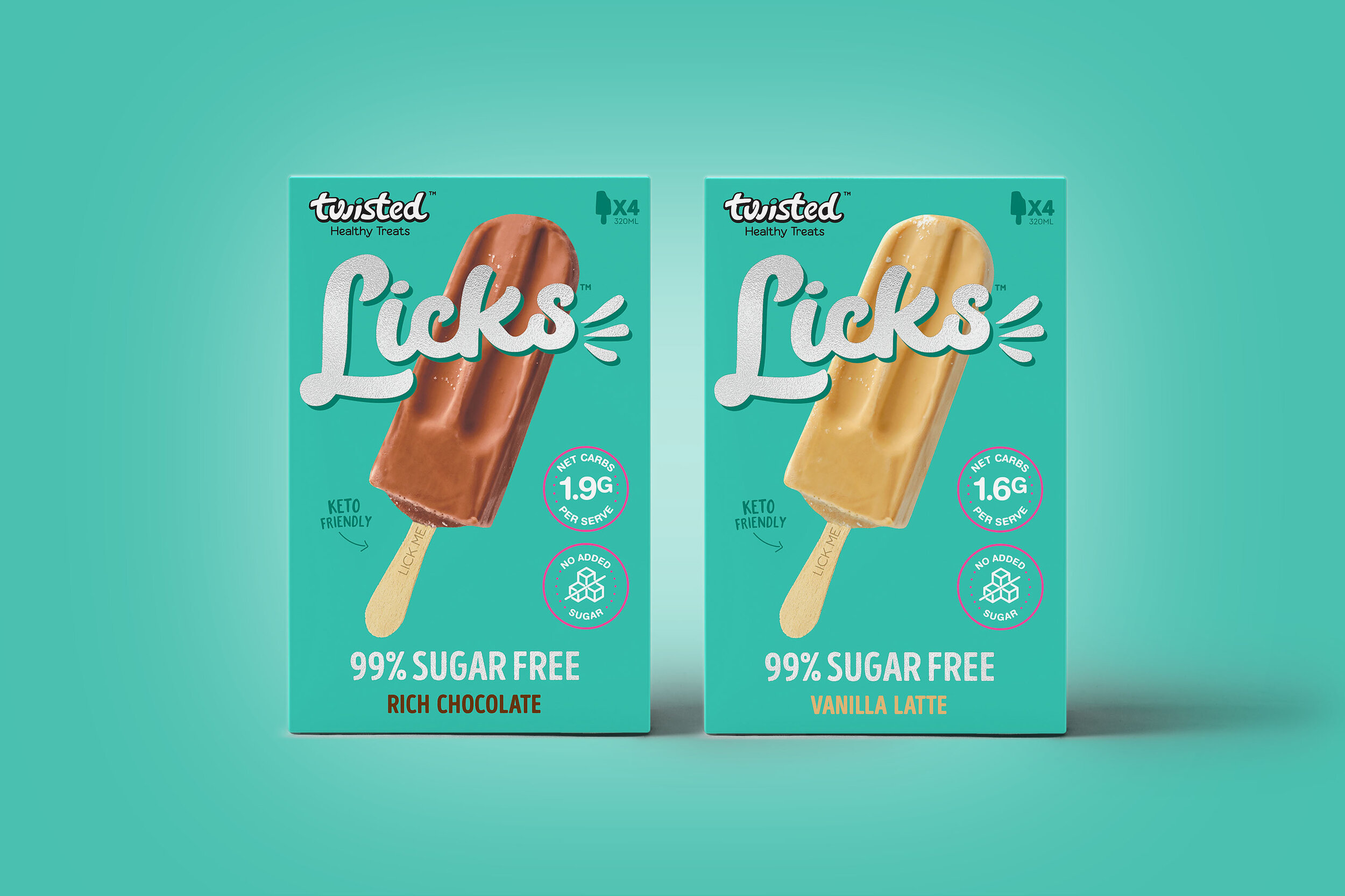
Design Brief: To create the typographical logo and packaging for a new product. The target audience: decadent lovers of desserts who are still health-conscious.
Challenge: It needed to not only look special but have a luxe feel. With shelf-competition, it had to stand out among other Twisted packaging and competitors in stores.
Solution: I chose a very clean simple design, showing off the product and printed the logo in silver foiling.
Feedback: The packaging and logo have had great feedback from the public and been a massive seller. They have even been picked up by the US market. I’ve worked with Cass and the team at Twisted for five years, designing all their packaging and branding. They have gone from being in 50 Woolworths store to now having their product in every store nationally and it’s just as popular in Coles.


Animation
I worked with some of the best animators in Victoria to create engaging content for my client. Our working partnership allows us to bring to life the creations I design.
Food Packaging Branding Animation
Licks Plant Based
The newest addition to the Licks family.
Licks Plant Based are dairy free and made with natural coconut cream. The design reflects the clean, all natural ingredients found inside the box. The colour palette is the familiar soft pastels and the fruit gives it a joyful feel. I know you're not supposed to have favourites but I love these!


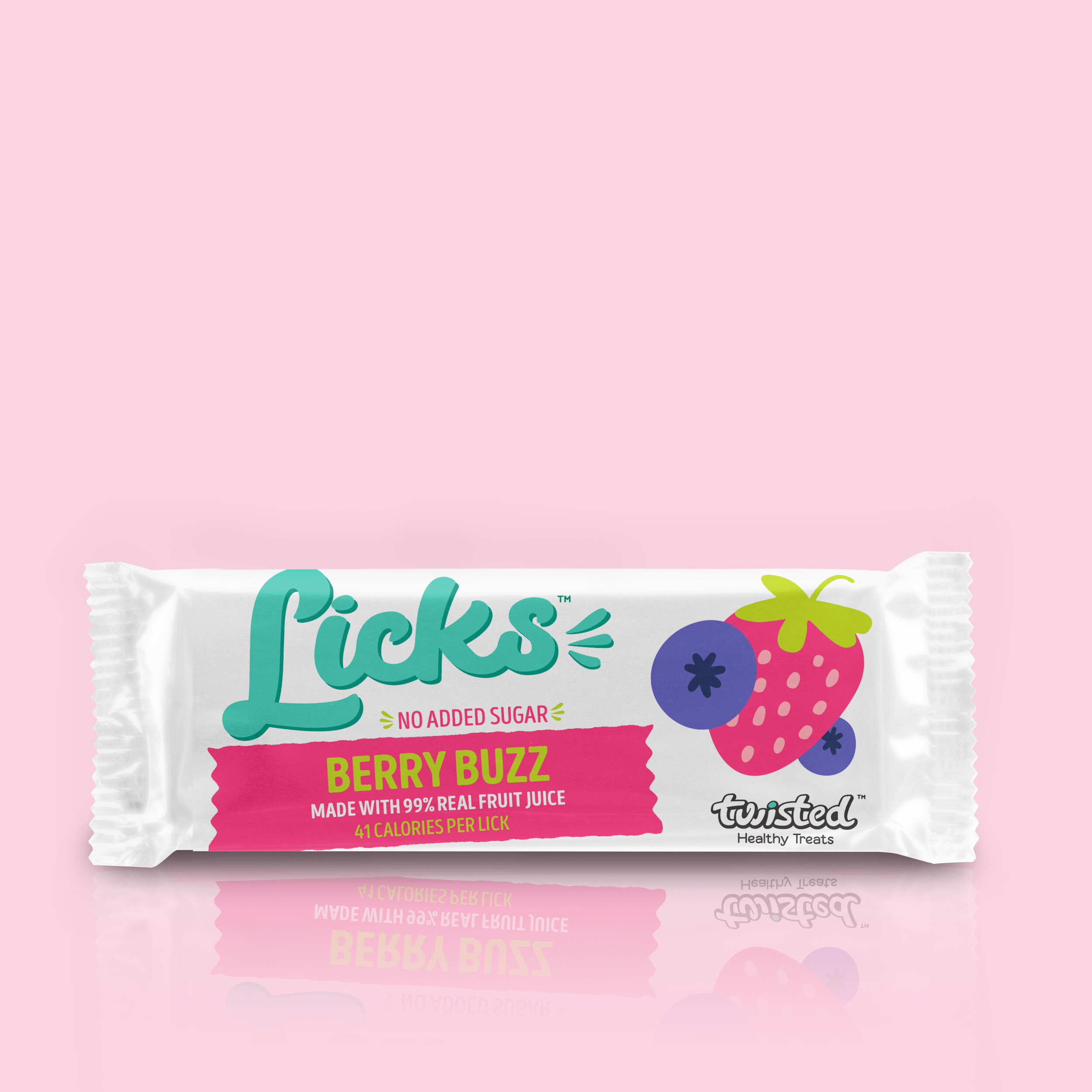
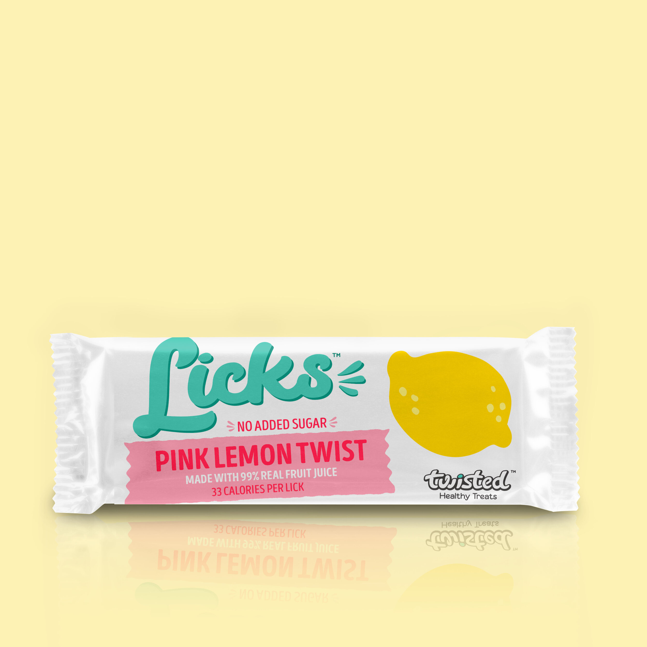
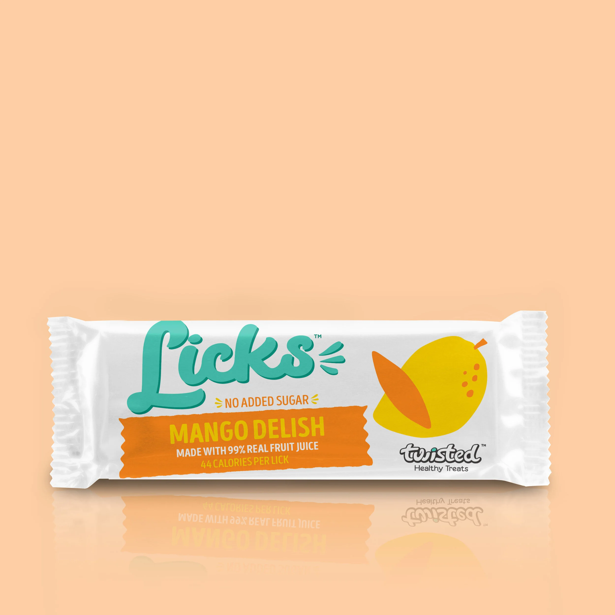
Licks wraps
I created a special line of Licks wraps for school canteens across the country. The illustrations needed to appeal to kids. Vibrant colours gave the packaging a more playful look and drew attention to the product.


