Webb & Gray
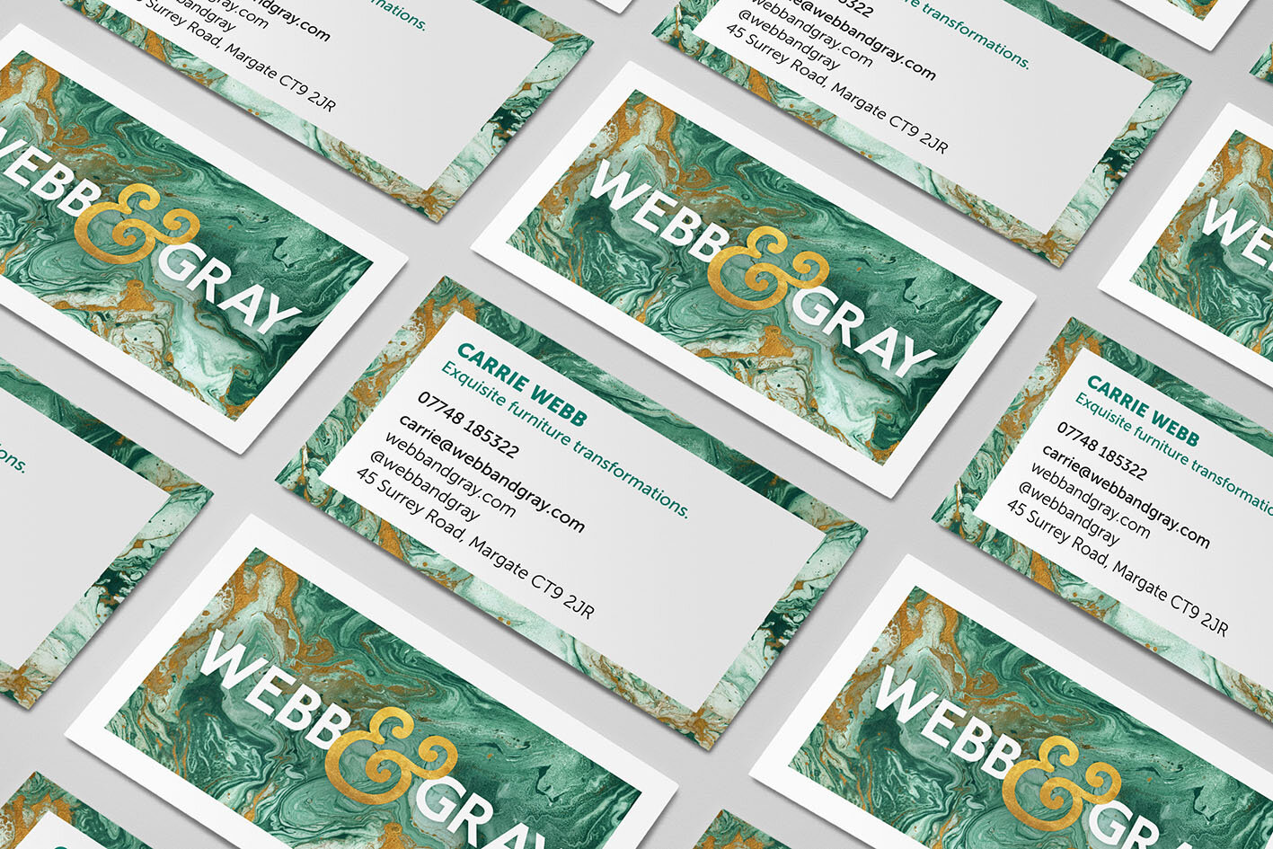
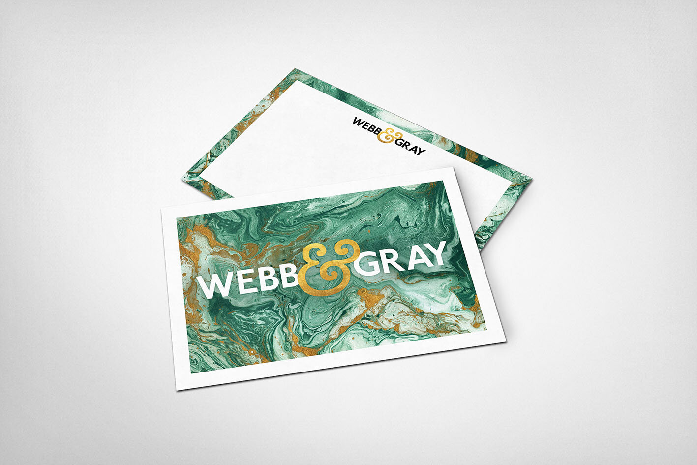
Design Brief: Webb & Gray wanted a new logo and brand identity.
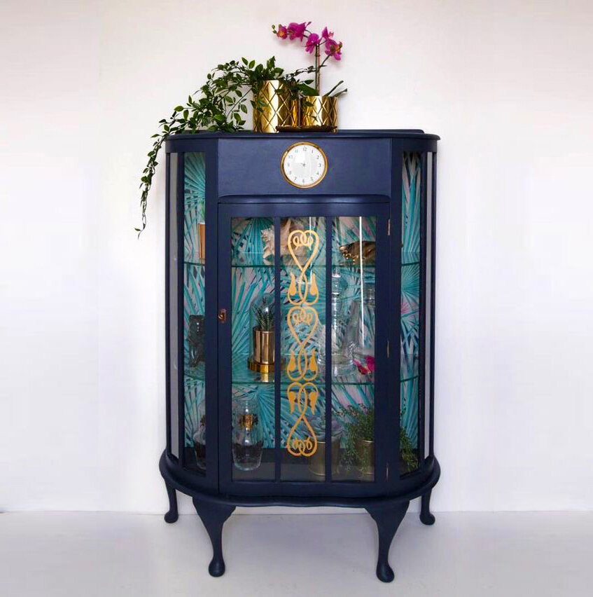
Challenge: A fabulous husband and wife team who specialise in high-end upcycling that has a period element but with a touch of modern. Carrie Webb is an interior designer and lover of modern but at the same time adores French period furniture. Combining the two competing eras was an exciting challenge.
Solution: Although this went back to the drawing board a few times, which is unusual for me, we knew we had scored a winner with the final design. A classy colour combination with clean font and a touch of gold brought all the elements together.
Feedback: It was tricky to reflect both eras but in the end they were ecstatic with the result. Loving their work helped me create design content and features that I knew Webb & Gray would love too. I’m now assisting them with their website and social media tiles.


